Team:Aberdeen Scotland/parameters/invest 3
From 2009.igem.org
(→Monte Carlo Simulations) |
(→Simulations for two parameters) |
||
| (8 intermediate revisions not shown) | |||
| Line 2: | Line 2: | ||
{{:Team:Aberdeen_Scotland/header2}} | {{:Team:Aberdeen_Scotland/header2}} | ||
| - | = | + | = Simulations for 3 parameters: Monte Carlo Simulations = |
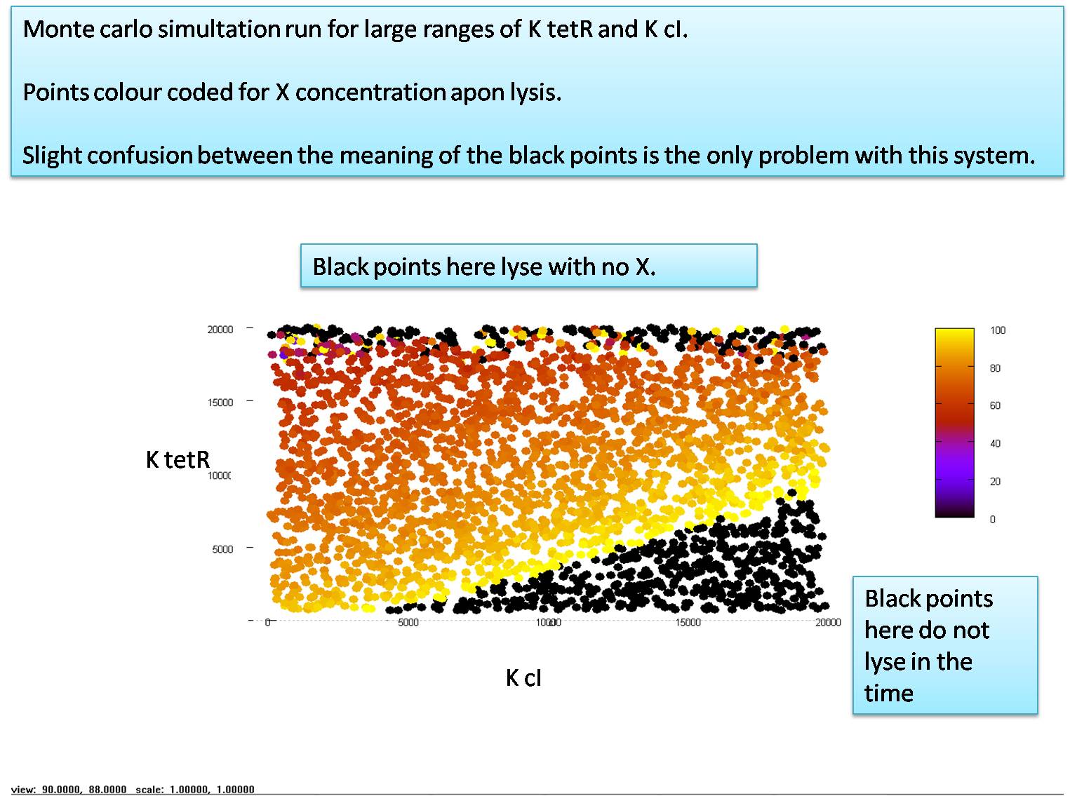
| - | To test | + | To test the performance of our design depending on the parameter values, we utilised what is known as a "Monte Carlo Simulation". This works by running the entire simulation thousands of times, each time with a different set of parameter values, which are randonly chosen from a uniform distribution. We choose the three most crucial parameters, namely, K<sub>LacI</sub>, K<sub>TetR</sub> and K<sub>cI</sub>, and plot each of them on an axis of a three dimensional plot. Each time we run a simulation, we randomly chose these three variables between the lower expected limit and the upper expected limit and plot a point in our 3D graph corresponding to the randomly chosen values. This point is then colored to show how the simulation worked. We plot a black point if the cell lysed before the input was added (by accidently triggering itself) or if the cell did not lyse in a given period (usually 9 hours). All simulations which exhibited cell lysis in the desired time frame were plotted in color. The color is matched to the the amount of X that was produced as a percentage of the maximum possible X. This is shown in the image below, which has the K<sub>LacI</sub> axis obscured for easier viewing. |
| - | '''Note that this simulation | + | '''Note that this simulation corresponds to a model that has LacI repression lifting and quorum sensing both modelled as on/off switches with 100% efficiency.''' We will see the full model and accompanying Monte Carlo simulations in the next section. |
[[Image:Monte Carlo Graph 1.jpg|center|700px]] | [[Image:Monte Carlo Graph 1.jpg|center|700px]] | ||
| - | Two interesting points to note are the black areas. The area in the bottom right never lyses because of a combination of K<sub>TetR</sub> being too low and K<sub>cI</sub> being too high. This effect | + | Two interesting points to note are the black areas. The area in the bottom right never lyses because of a combination of K<sub>TetR</sub> being too low and K<sub>cI</sub> being too high. This effect arises as K<sub>TetR</sub> is reduced, since Holin production turns on only at very low levels of TetR. If K<sub>cI</sub> is high, it means the system requires a large amount of cI to repress the production of TetR. This in turn means that some TetR is stochastically produced, which is then free to repress the production of Holin. |
| - | + | The upper black area is created simply because K<sub>TetR</sub> is so high that it takes a large quantity of TetR to repress Holin production, and hence, Holin is produced long before it should be. | |
We can also see the colour scale showing exactly how much of the glue (molecule X) was present at the point of lysis. | We can also see the colour scale showing exactly how much of the glue (molecule X) was present at the point of lysis. | ||
| + | |||
| + | {{:Team:Aberdeen_Scotland/break}} | ||
| + | = Simulations for two parameters = | ||
| + | |||
| + | If we only have two parameters to explore it makes more sense to use the following method: | ||
| + | |||
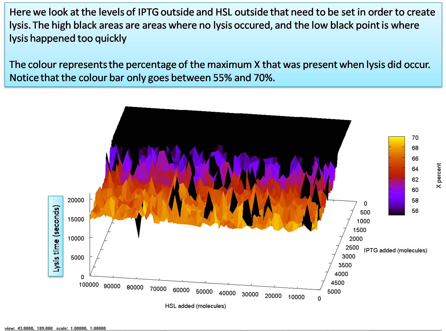
| + | Take two parameters which you wish to explore. decide what the maximum and minimum of each parameter should be and chose an appropriate "step" (i.e explore K<sub>TetR</sub> from 700 molecules to 7000 molecules, running simulations every 100 molecules... and a similar set up for another parameter, e.g K<sub>CI</sub>). We then run a simulation for every possible combination of the two parameters and plot them in a 3D colour graph (which has 4 usable dimensions if we include colour). We chose to use the height dimension to display the time it took for the simulation to lyse, and the colour to show the percentage of the maximum glue that had been produced, at the time of lysis. | ||
| + | |||
| + | Doing this for the added levels of HSL and IPTG in an input dependant model (which will be introduced in the next page) we get the following graph: | ||
| + | [[Image:Input Model Graph 2.jpg|center|700px]] | ||
<html> | <html> | ||
| Line 20: | Line 30: | ||
<tr> | <tr> | ||
<td> | <td> | ||
| - | <a href="https://2009.igem.org/Team:Aberdeen_Scotland/parameters/invest_1"><img src="https://static.igem.org/mediawiki/2009/e/ed/Aberdeen_Left_arrow.png"> Back</a> | + | <a href="https://2009.igem.org/Team:Aberdeen_Scotland/parameters/invest_1"><img src="https://static.igem.org/mediawiki/2009/e/ed/Aberdeen_Left_arrow.png"> Back to Dissociation Constants</a> |
</td> | </td> | ||
<td align="right"> | <td align="right"> | ||
| - | <a href="https://2009.igem.org/Team:Aberdeen_Scotland/parameters/invest_4">Continue <img src="https://static.igem.org/mediawiki/2009/4/4c/Aberdeen_Right_arrow.png"></a> | + | <a href="https://2009.igem.org/Team:Aberdeen_Scotland/parameters/invest_4">Continue to Quorum Sensing Problems <img src="https://static.igem.org/mediawiki/2009/4/4c/Aberdeen_Right_arrow.png"></a> |
</td> | </td> | ||
</tr> | </tr> | ||
Latest revision as of 21:05, 21 October 2009
University of Aberdeen - Pico Plumber
Simulations for 3 parameters: Monte Carlo Simulations
To test the performance of our design depending on the parameter values, we utilised what is known as a "Monte Carlo Simulation". This works by running the entire simulation thousands of times, each time with a different set of parameter values, which are randonly chosen from a uniform distribution. We choose the three most crucial parameters, namely, KLacI, KTetR and KcI, and plot each of them on an axis of a three dimensional plot. Each time we run a simulation, we randomly chose these three variables between the lower expected limit and the upper expected limit and plot a point in our 3D graph corresponding to the randomly chosen values. This point is then colored to show how the simulation worked. We plot a black point if the cell lysed before the input was added (by accidently triggering itself) or if the cell did not lyse in a given period (usually 9 hours). All simulations which exhibited cell lysis in the desired time frame were plotted in color. The color is matched to the the amount of X that was produced as a percentage of the maximum possible X. This is shown in the image below, which has the KLacI axis obscured for easier viewing.
Note that this simulation corresponds to a model that has LacI repression lifting and quorum sensing both modelled as on/off switches with 100% efficiency. We will see the full model and accompanying Monte Carlo simulations in the next section.
Two interesting points to note are the black areas. The area in the bottom right never lyses because of a combination of KTetR being too low and KcI being too high. This effect arises as KTetR is reduced, since Holin production turns on only at very low levels of TetR. If KcI is high, it means the system requires a large amount of cI to repress the production of TetR. This in turn means that some TetR is stochastically produced, which is then free to repress the production of Holin.
The upper black area is created simply because KTetR is so high that it takes a large quantity of TetR to repress Holin production, and hence, Holin is produced long before it should be.
We can also see the colour scale showing exactly how much of the glue (molecule X) was present at the point of lysis.
Simulations for two parameters
If we only have two parameters to explore it makes more sense to use the following method:
Take two parameters which you wish to explore. decide what the maximum and minimum of each parameter should be and chose an appropriate "step" (i.e explore KTetR from 700 molecules to 7000 molecules, running simulations every 100 molecules... and a similar set up for another parameter, e.g KCI). We then run a simulation for every possible combination of the two parameters and plot them in a 3D colour graph (which has 4 usable dimensions if we include colour). We chose to use the height dimension to display the time it took for the simulation to lyse, and the colour to show the percentage of the maximum glue that had been produced, at the time of lysis.
Doing this for the added levels of HSL and IPTG in an input dependant model (which will be introduced in the next page) we get the following graph:
 Back to Dissociation Constants Back to Dissociation Constants
|
Continue to Quorum Sensing Problems 
|
 "
"

